index
The new Kyoto station
click on images for full-size:
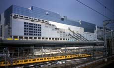

The new Kyoto station seen from the south over the tracks

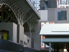
Part of the north face of Kyoto station

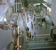
View east along the interior of Kyoto station

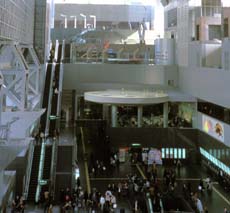
View west along the interior of Kyoto station

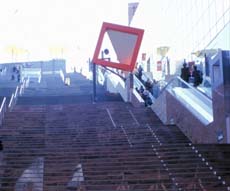
The final stairs and escalators to the roof garden at Kyoto station

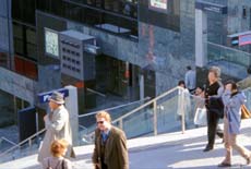
People walking on a mid-level at Kyoto station

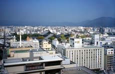
View north from the roof of Kyoto station over the city towards Mt. Hiei
I hadn't expected much. My skepticism was fueled by the controversy surrounding the competition, bad press from disappointed architects, worried tourist officials, and anti-modernizers in this tradition-minded city, plus a general worry about high buildings in Kyoto. I had seen drawings of the winning design but not paid them much attention, being more interested in the rejected alternatives from Ando and Isozaki. From the drawings it looked hulking and rectangular, a wall dividing Kyoto. [There are pictures on the web of the exterior of the building, of the interior, and a brief history of the station.] My skepticism was challenged when we stopped there to change trains for a rural area. We had no time to go into the building, but seen from the tracks its mass and texture was more interesting than I had expected, with surface decorations on the south side announcing a pattern that never quite materialized. Perhaps because the building is so long, its height didn't seem as bothersome. Coming back the next day, we crossed into the building itself. The large central space was exciting, visually open but not so regular that it could be taken in with a glance. Later I roamed around taking pictures. The shady north front was hard to photograph. Then I went inside and began ascending the escalators. I was surprised, when I arrived at what I thought would be the top, to discover an even longer set of stairs and escalators continuing up to the garden on the 11th floor. Then there were sky bridges over the top of the high space. In many buildings false moves or awkward solutions put you on guard for the rest of the experience. This building put me into that pleasant state of "what will they think of next?" -- a relaxed trust that the architect will solve problems and create opportunities. You appreciate the architect's thought and care, so that even if you come not to like the design you still think it was impressive. There are problems but they don't detract from the whole once that trust is obtained. For instance the thin wing housing parts of the Isetan department store makes them difficult to find, and difficult to get away from once you enter the wing. That area felt claustrophobic, a slim volume needed to wall off the long stairs and keep the front facade going, which was then filled with whatever would fit. The grammar and social use of the station have become more complex. There were still the same movements north-south through the building onto the platforms and bridges. But there were now other patterns of east-west movement into the hotel and along the shops, and vertical patterns up to more shops and the sky garden. Not just tourists; there were locals viewing the city from the roof, and couples finding nooks of privacys there and along the sky bridges. In the main hall and on the escalators-and-stairs there is no sense of an ordinary environment. The heights and sight lines are too long, the vistas too dramatic, Does any other building have such a long diagonal up/down path? The mega-gesture -- without it the building would just be another mall. For the building is a mall, a three-dimensional list of attractions and merchandise, located at the transportation junction of railroad and bus and subway. Of course the spatial drama is at the service of the commercial purpose, but only by seeming more extravagant than is needed for that purpose. Jon Jerde has set that expectation. The diagonal sweep of the stairs, the high-roofed central hall, the multiple spaces, functions, layouts, institutions, traffic patterns and pathways felt unified because of the repetitive grids and diagonals that structure the facades and the space. It was all shiny and new -- what would it look like if the economy really took a downturn? Would it make a good ruin, with vines growing from the balconies, and the roof partly down? Or the grand stairway seized by nomads, or overshadowed by huge machines, or with the flickering presence of dematerialized tourists?