index
Cergy
click on images for full-size:
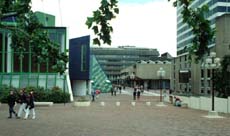

Walkway on the podium at Cergy le Préfecture

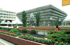
Building forms at Cergy

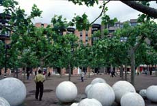
Street sculpture at Cergy
I went to visit another new town that a French friend said was considered more successful than Saint-Quentin, Cergy le Préfecture. Seen from a distance the residential districts seemed pleasant enough, with a varied topograpy and more detached single houses. The town center was the featured attraction. There an area perhaps five city blocks square had been raised up on a podium, with traffic passing underneath. The buildings thrust three to six stories up through the podium. They were rooted below, so that the surface I walked on was a floating membrane, like the surface of the sea penetrated by bold icebergs. The buildings' sharp geometries clashed in shape and color and surface texture. In some ways the area resembled a mall or shopping development, but the buildings were too large for that, their shapes too various, and they contained too many different functions (a music school, a public school, a library, the civic offices, and so on, as well as stores and restaurants). This was a town, not a unified mall environment. Yet the effect was very different from most pedestrianized areas, because you were constantly reminded that you were above, that there was a border where you stop and look down, a place of descent and abrupt change. I felt ungrounded. It was not a bad feeling. In its business area Cergy is more livable and fun than the center of Saint-Quentin. Both, but especially Cergy, show a style that is also on display at La Défense, a style offering sharp juxtapositions of geometries and bold colors, all in big blocks with relatively simple forms. The outside of the buildings in the downtowns at Cergy and Saint-Quentin resemble the inside of a mall, in the sense that each item strives for uniqueness and distinction from its neighbors. There is less variation on the surface of each single building than there could be on an American building. It is as if they were planned by giant designers whose huge pencils couldn't draw any detail smaller than five meters across. This makes for visual fun, but when everything is shouting how unique its big form is, each has to be outrageous to stand out. The resulting forms don't much relate to the social grammar of their use, or to the townscape, so they threaten to turn visual complexity into place simplicity.