Crowding versus complexity

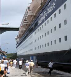
Cruise ship exterior

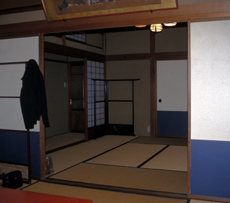
A room at a Japanese inn (near Niigata)

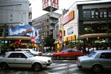
Street scene, Toyama, Japan
Places do not get more complex just because they have more things piled into them. Contrast these two excerpts from adjacent articles in a travel magazine:
The interior design [of the cruise ship Voyager of the Seas] can only be described, depending on your sensibilities, as either wonderfully entertaining or woefully over the top. It's not that there is a lack of good, or even brilliant design; on the contrary, there is too much of it. Every detail has been analyzed, fussed over, and conceptualized until the last drop of significance has been squeezed out of it. Nothing is left to speak for itself. No bar or restaurant is without a theme, no wall without a painting, no empty space without a sculpture, no carpet without a meaningful pattern, no recess without a lighting effect. "Hall 2000, 207"^
As the world becomes saturated with "stuff" and with data -- more than twenty thousand sites on the World Wide Web deal with information overload -- simplicity and silence seem more precious than ever. And as more and more of us accelerate into a multitasking blur, the slowness and space of a ryokan can feel more than ever like heaven. If there a hundred things in a room, [the Japanese inn called] Tawaraya taught me, the mind gets dizzy and overwhelmed; if there is just one, it grows so calm and spacious -- so attentive -- that in that one it can find a universe. Iyer 2000, 200
It is easy for us in a media-rich age to equate complexity with an overflow of information. But if a place exhibits or celebrates such overflow it may or may not be complex. It might just be a crowd of serial simple intensities. Some places should give architectural expression to our media-cluttered world, but we also need calmer places for attentive deep involvement with a few things that can reveal a world.