| Today's poet almost certainly can't help but think about how their poem looks on a page. It's easy to change line breaks, stanza breaks, word spacing, line length and fonts with a word processing program. And it's interesting to see how changing the line length or a stanza break can slightly alter the meaning of the text. But what happens when we take the words out of the poem and the letters out of the words and play with their relation to the page? What happens when the visual form of the poem is as important as the words that make it? Although the Chinese were actually the first to invent movable type, Johannes Gutenberg is widely credited for inventing the printing press around 1454, when his Guttenberg Bible became the first mass-produced book. In no time, typesetting technology spread rapidly across Europe. Within only fifty years, thousands of printers set up shops in over two hundred European cities. The invention of the printing press was quite the revolution. Not only did moveable type allow for the mass production of books (before its invention scribes had to write out entire books by hand--you try copying an entire book word-for-word!) and provide a healthy income for early entrepreneurs, but it opened an expansive field in which artisans, visionaries, and craftsmen could experiment with the visual aspect of poetics. Indeed, since the early beginnings of the press, artists began creating what would later be called "concrete poetry." In the early 20th century, experiments in visual poetry occurred in Russian Futurist typographic work, the Italian Futurists, and in the "calligrammatic" works of Guillaume Apollinaire. (The word calligram comes from the Greek "calli" and "gramma" which together mean "beautiful writing.") 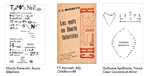 | But it wasn't until the early fifties that the term "concrete poetry" was coined. Amazingly, the term came about simultaneously in three countries. In Switzerland, Eugene Gomringer, published a book of poetry in which each poem only consisted of one word. He spatially arranged each word so that the placement of the word represented the poem's meaning and called his word placements "constellations." Swedish artist Öyvind Fahlström wrote a Manifesto for Concrete Poetry in 1953. In it, he described a poetry in which the words were used in the way a painter would use representational forms. And at the same time in Brazil, Haroldo de Campos, Augusto de Campos and Décio Pignatari formed the Noigandres group, named for Ezra Pound's Canto XX. The group produced a literary magazine which served as an experimental ground for their three-dimensional poetry which they called Poesia Concreta. By 1956 the First National Show of Concrete Art included posters of non-linear poems. In 1959, the first international show of concrete poetry was held in Stuttgart, Germany and by the early 1960's, exhibitions of concrete poetry were widespread in Europe, Japan and the United States. And although the term "concrete poetry" is now a blanket term for the many forms of visual poetry, it lived on through artists such as Steve McCaffery, Emmett Williams , and bpNichol. This issue of Poems that Go features work which continues in the tradition of typographical experimentation--this time on the Web. Our featured artist, Michael Madsen, presents "Letters Demand Things," in which Madsen seeks to explore the relationships between letters themselves-- both in what they represent and their physical structure. He masterfully breaks the letters down into sounds and shapes, all the time allowing the audience a first-hand glimpse into his textual experiment. "Jabber: The Jabberwocky Engine" by Neil Hennessey builds up these letters to produce nonsensical words that sound like English words, in the same way that the words from Lewis Carroll's Jabberwocky sound like English words. Hennessey realizes a linguistic chemistry with letters as atoms and words as molecules. And finally, YOUNG-HAE CHANG HEAVY INDUSTRIES presents "Betty Nkomo" in their signature style: devoid of color, interactivity and graphics, leaving the audience with one rhythmically charged word on the screen at a time--making what else? Poetry. For more information visit:
Concrete Poetry: A World View, Mary Ellen Solt http://www.ubu.com/papers/solt/index.html
Figuring The Word, Essays on Books, Writing, and Visual Poetics, Johanna Drucker. Granary Books. 1998.
Pilot Plan for Concrete Poetry
Augusto de Campos, Decio Pignatari, Haroldo de Campos: Brazil. 1958. Specific Concrete-Visual Poems on the WWW-InterNet. Selected and Indexed by Michael P. Garofalo. http://www.gardendigest.com/concrete/cvpindex.htm
Ubu.com
TOP |